
Designers, architects, and copywriters of the world have a pretty difficult task to stand up to in life. They're supposed to make things easy to read, accessible, and aesthetically pleasing. But what happens when all of that goes straight out the window and you're left with a rotating billboard between two poles that just keep getting hit over and over and over? You don't blame it on the sh*tty design — you blame it on the person who came up with the sh*tty design.
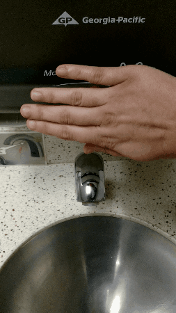
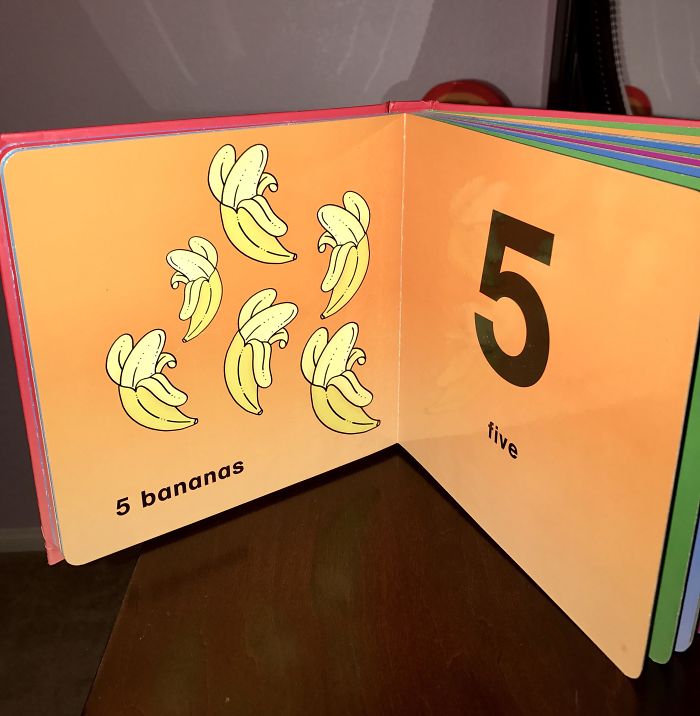
Sometimes it feels like designers said “f*ck it” and decided to just troll us with perfectly placed “penises” and ridiculously inconvenient hand towel dispensers over sinks. I get that life has become harder and harder by the minute recently, but would it hurt to double check things now and again? From kids coloring books about counting with the wrong numbers to poorly done advertisements on elevators that show an airplane slowly and scarily descending downward — some designers completely missed the mark.
Maybe sometime in the future we'll have completely accessible and easy to understand designs, but in the meantime — let's all laugh at the mistakes for just a bit longer. I know the next time I go to reach for a lemon at the grocery store and I'm presented with a cute little sign that reads “lemons are perfect for making orange juice” — I'm going to sigh, laugh, roll my eyes, and take those lemons and make some f*cking lemona—I mean orange juice!